Have you ever landed on a webpage where all the text looks the same, making it nearly impossible to distinguish headlines from body copy? Poor typographic hierarchy isn't just frustrating - it can actually prevent readers from absorbing your content's message. Let's explore how to transform your typography from confusing to crystal clear with proven hierarchy principles that will elevate your designs.


Understanding Typography Basics

What is Typography?

Typography is the art and technique of arranging type to make written language legible, readable, and visually appealing - turning plain text into powerful communication. Beyond mere decoration, it's about creating clear visual paths through your content that help readers understand information hierarchy and relationships.
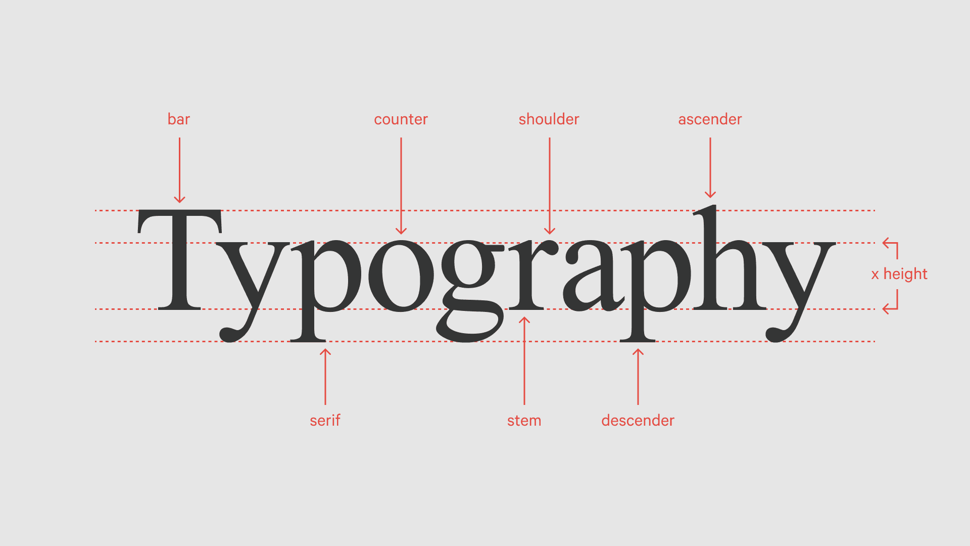

Hierarchy in typography showing classic typographic scale


Here's what you need to know about the key bits:

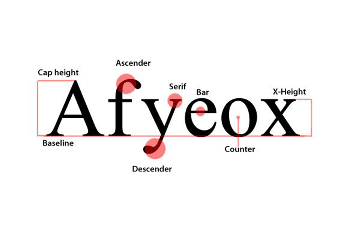
  • Selecting typefaces: Each typeface brings its own personality to the table, serving different purposes based on their characteristics. A typeface's x-height, stroke contrast, and overall form contribute to its effectiveness in different contexts.

  • Point sizes: These either make or break your design's readability. For digital content, you'll want to stick to body text between 16-18px - it's proven to work best for most readers. Printed materials should be kept between 10-12pt, while headlines should scale up proportionally from there.

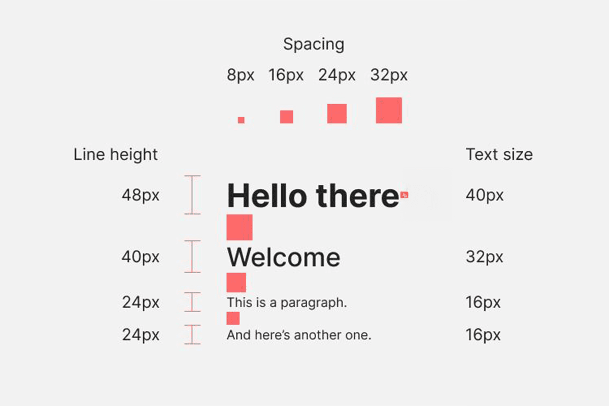
  • Line spacing: One of your most powerful tools when it comes to shaping that visual path. Studies indicate that a line height of 1.5x the font size creates the optimal reading experience. It improves reading comprehension by creating clear distinction between lines while maintaining visual connection. For reference, this translates to about 24px line height for a 16px text.

  • Letter spacing: Proper kerning and tracking ensures letters maintain optimal spacing for readability, particularly important in headlines and display text.


Key Elements of Typography

Let's break down what you're working with:

Fonts

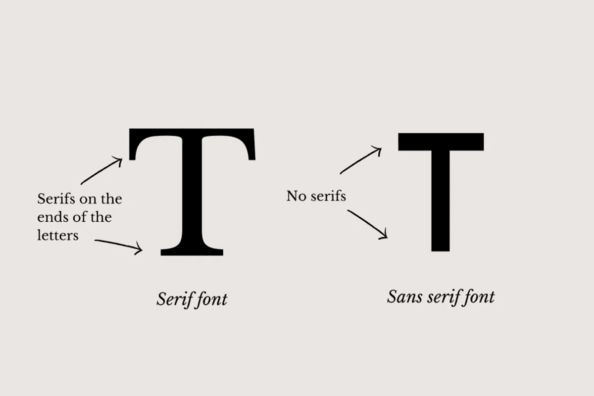
  • Serif fonts: these are your reliable workhorses of typography. They've got those small decorative strokes that actually help readers track along lines of text. There's a reason The New York Times has stuck with them - they make reading long articles feel effortless.

  • Sans serif fonts: these are your modern problem-solvers. They keep everything crystal clear, especially on screens and at smaller sizes. Look at how Apple's San Francisco font family maintains perfect readability whether you're squinting at your phone or staring at a massive display.

The psychology behind fonts isn't just designer talk - it’s part of your marketing strategy. Different typefaces trigger different responses in your readers. For example, ‘Georgia’ is a font that brings authority to the table while keeping things more approachable than its stuck-up cousin, ‘Times New Roman’.


Contrast

When we talk about contrast, we're talking about purposeful differences that guide your readers. This includes:

  • Size contrast: Major headers that should be at least 180% of your body text size for clear differentiation.

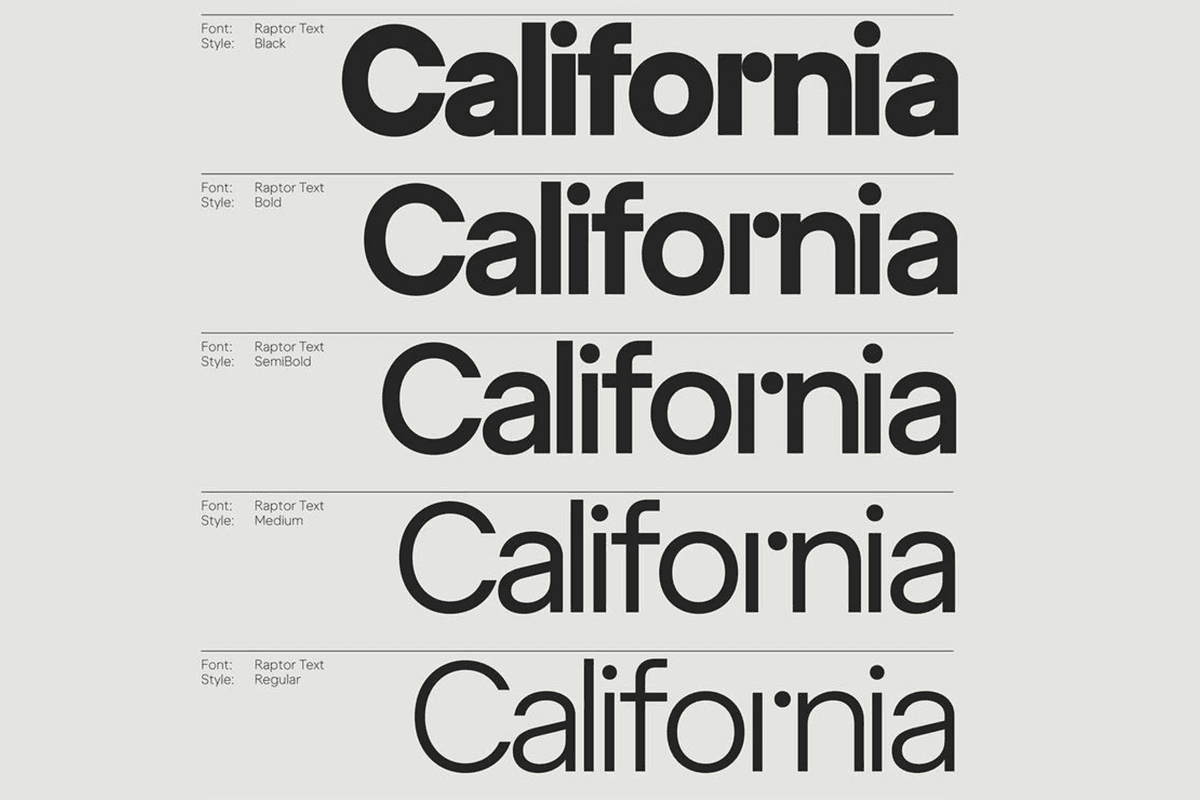
  • Weight contrast: Playing with weight is another powerful move - switching between regular and bold weights lets you create clear hierarchies even when keeping text the same size.

  • Color contrast: Ensure your text stands out clearly against its background. lower contrast ratios can strain eyes and make text difficult to read, especially for users with visual impairments or those reading in bright sunlight.

popular sans serif fonts web fonts


White space

Proven to be more than just empty gaps in your design, white space is an absolute powerhouse when it comes to readability. By strategically placing space between elements, you're actually helping readers understand how different pieces of content relate to each other. It's particularly crucial around key elements like headlines or call-to-action buttons, where that extra breathing room helps important content stand out naturally without needing to make it bigger or bolder.

visually appealing creating hierarchy body copy negative space


Creating a Typographic Hierarchy

Type Size and Hierarchy

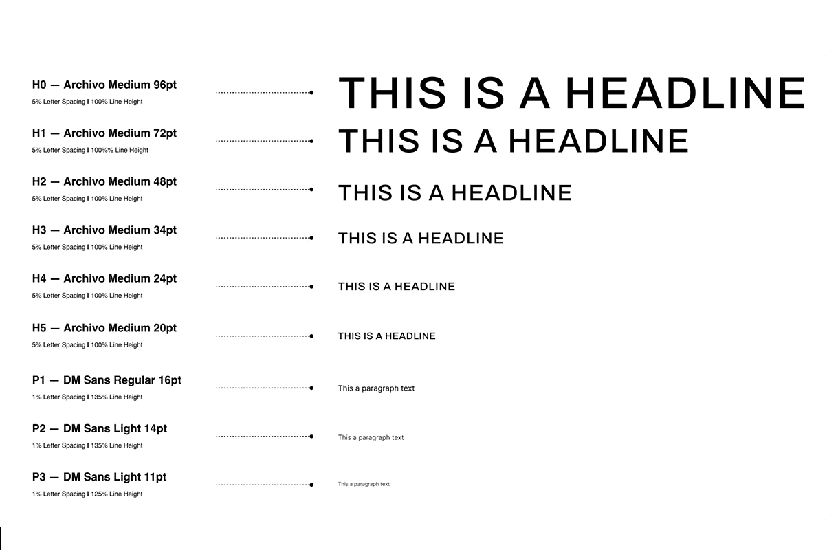
Effective size hierarchy relies on meaningful and consistent differentiation. Here are the recommended base sizes:

  • Body text: use 16px as your digital foundation (the main content that carries your message).

  • Subheadings: building up from your body text, 24px is the sweet spot for these title breaks.

  • Main headings: primary titles are scaled up to 36-48px, grabbing attention with ease.

  • Micro text: your supporting content (like captions and metadata) are best kept to a 14px maximum.

By maintaining these proportional relationships between text sizes, you create a natural visual hierarchy that guides readers through your content with ease.

typographic hierarchy, web page visual hierarchy, typographic composition


Choosing Coordinating Typefaces

Successful typeface combinations balance contrast and harmony through:

  • Similar x-heights between paired fonts

  • Complementary letter shapes and proportions

  • Appropriate style contrasts (serif/sans-serif, weight variations)

  • Limited palette (2-3 typefaces maximum)

These principles ensure your typefaces work together to create clear hierarchy while maintaining visual cohesion across your design.

multiple typefaces, combining typefaces, choosing typefaces


Building a Visual Flow

Levels of Typographic Hierarchy

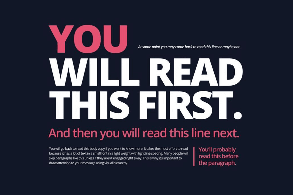
A clear typographic hierarchy guides readers through your content by establishing distinct levels of information. Each level serves a specific purpose in the reading experience:

Primary Level (Headlines)

This level creates immediate visual impact, helping readers instantly understand the main topic and decide if the content is relevant to their needs.

  • Largest size (typically 36-48px)

  • Boldest weight

  • Most distinctive treatment

  • Often paired with extra white space

Secondary Level (Subheadings)

This level breaks down complex information into manageable parts, making content easier to scan and understand while maintaining clear connection to the main topic.

  • Medium size (around 24px)

  • Moderate weight

  • Clear but subordinate to primary headers

  • Helps chunk content into digestible sections

Tertiary Level (Body Text)

At this level, comfort and clarity become crucial as readers engage with your detailed content. Proper spacing and sizing ensure they can maintain focus during longer reading sessions.

  • Standard reading size (16-18px)

  • Regular weight

  • Optimized for extended reading

  • Consistent line height and paragraph spacing


Creating a Visual Flow

Visual flow isn't just about what elements you include - it's about how these elements work together to guide readers through your content. A well-structured layout uses consistent patterns and clear relationships to create an intuitive reading experience.

Here are the key components that make this happen:

  • Maintain consistent spacing patterns (8px or 16px increments work well)

  • Align elements to create clear relationships

  • Use indentation and margins to show content hierarchy

  • Create clear visual breaks between sections

create typographic hierarchy, creating hierarchy, distinct hierarchy with written words


Effective Typographic Hierarchy in Practice

Common Mistakes to Avoid

Insufficient size contrast

When headers and body text sizes sit too close together, readers struggle to quickly grasp the content's structure. The key is creating meaningful size relationships - each level of your hierarchy should have a clear, distinct purpose that guides readers through your content.

A lack of clear progression between levels forces readers to work harder to understand content relationships.

Spacing decisions

Often overlooked, this can either make or break your typography. Cramped line heights reduce reading speed and comprehension, while inconsistent spacing between sections muddles content relationships.

Good spacing isn't about following rigid rules - it's about creating purposeful relationships between text blocks that help readers process information naturally. When spacing is thoughtfully applied, it creates clear visual paths through your content.

Overcomplication

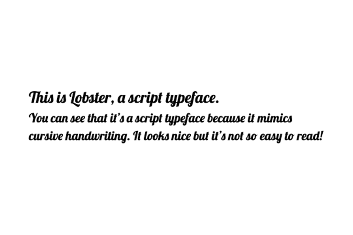
Often stemming from trying to make everything stand out, which ironically results in nothing standing out. Using too many typefaces dilutes their individual impact and creates visual noise. When multiple elements compete for attention, readers lose their sense of priority and direction.

The most effective hierarchies often rely on careful manipulation of just a few elements: perhaps two typefaces with thoughtful size and weight variations. This restraint actually gives your key elements more impact, allowing readers to navigate your content intuitively rather than fighting through competing visual elements.

Fonts with appealing typeface, that draw attention in typography design


Best Practices for Readability

Successful typography hinges on several key practices. Start with contrast ratios - the Web Content Accessibility Guidelines (WCAG) recommendation of 4.5:1 for body text ensures legibility across devices and lighting conditions. Pay attention to your line length too; keeping it between 45-75 characters creates the optimal reading experience.

Most importantly, consider how your content adapts to different devices. What works on desktop might need adjustment for mobile users, who typically hold devices closer and need slightly larger text for comfortable reading.

Creating a Typographic Hierarchy for Your Design

Scope and Functionality

Before diving into typography decisions, consider your content's purpose. Long-form articles (i.e. academic articles) need different treatment than promotional material (i.e. blog posts). Your reading environment matters too. For example, while 16px body text works well on desktop, mobile users might need 18px for comfortable reading.

Mood and Personality

Typography should reflect your brand while maintaining readability. Take Airbnb's approach - their custom font family conveys approachability without sacrificing clarity. The key is consistency across platforms while adapting to different environments.
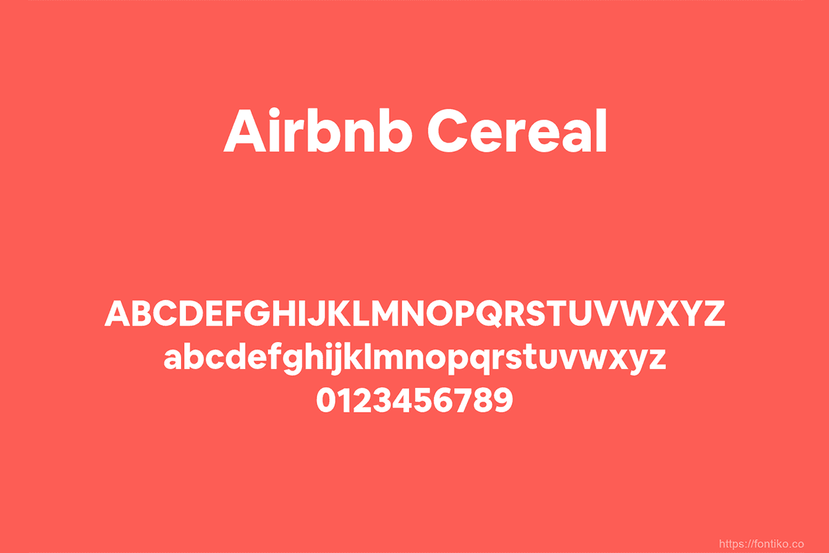

Airbnb's decorative fonts, with lowercase letters, created by their graphic designer


Conclusion

Thoughtful typographic hierarchy transforms your content from a wall of text into clear, engaging communication. By applying the principles we've covered - from building proper visual levels to using spacing and contrast strategically - you create designs that help readers understand and retain your message.

Want to know exactly where your typography should be working harder? Connect with James and Will to take a fresh look at your designs and pinpoint the typographic goldmines you might be sitting on.

Written by

Cailyn Büchner

Written by

Cailyn Büchner

Cailyn is besotted with sunsets, twisted novels, and unpredictable marketing that makes you question everything you thought you knew. Walks in nature are her secret weapon to recharging creatively.

Ready to supercharge your business?

See why 96+ happy customers love working with us!

Flexible subscription

No contracts

Ready to supercharge your business?

See why 96+ happy customers love working with us!

Flexible subscription

No contracts

Ready to supercharge your business?

See why 96+ happy customers love working with us!

Flexible subscription

No contracts